Best Home Page Web Design for 2021 – with Examples
By MOJO Team • September 6, 2021 •
By MOJO Team • September 6, 2021 •
By MOJO Team • September 6, 2021 • News,
If you’re considering a new home page design, no single website page will get as much traffic or work as hard to represent your brand.
As the first page most of your visitors will see, your homepage has a lot of roles to perform! It needs to convey who you are and what you do, show people around, and make it easy for them to find the info they’re looking for, and, hopefully, impress them too.
In this article, we’ll analyze some of the most well-designed homepages on the interwebs from both a visual and functional perspective, and find out why these principles work so well.
As you’ll see, sometimes even small changes or features can make a big difference when you’re deciding on the best home page design for your brand.
With 300 million customers and over 20 million active merchant accounts, PayPal’s website needs to cater to a lot of very different user needs.
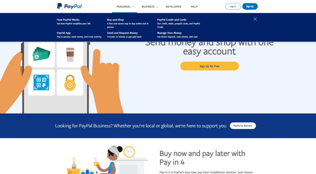
To achieve this, they’ve used their knowledge of their visitors and provided four quick navigation buttons at the top of the page: Personal, Business, Developer, and Help. Hovering over any of these options brings up a drop-down with more choices.
In this way, they make it easy for the user to get exactly where they want to go with fewer clicks, while still keeping the overall look of the site light and free of clutter. On the same eye level, they have quick links to log in for regular users or sign up if the visitor already knows they want to open an account.
Whatever visitors need, whether this is the first time they’re seeing the site or they use it every single day, the information they need is clear and easily accessible.
At the same time, they’ve also managed to include 3 Calls to Action (CTA) for prospective customers.
If your business revenue model speaks to multiple customers, identifying those segments and distinct needs paired with clear CTAs is a winning formula.
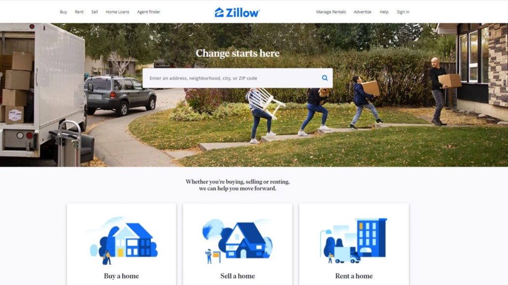
Online real estate marketplace company Zillow is no stranger to award-winning web design! Not only do they know how to win awards, but they also know how to drive traffic that converts, attracting over 33 million organic visits to the site each month.
Before your page can convert, you must understand your audience.
As with PayPal, they offer simple navigation options at the top of the page for various types of customers – renters, home buyers, sellers, and real estate professionals. Hovering over each navigation header provides easily visible options and provides greater clarity while allowing visitors the most direct path to their destination.
Interestingly, you’ll see they’ve placed a new service they offer, Manage Rentals, in the upper right corner. Why? Almost certainly because this is the area websites have ‘trained’ us to look for menu options, and they want this new option to get noticed.
Conversion is all about removing friction in the buyer's journey.
What gets noticed more than what you place in the center of the page? Zillow never forgets what launched a thousand searches - the address bar. A sophisticated interface allows visitors to input address, neighborhood, city, or zip code. Not sure of the street spelling? No problem, just input the street numbers and a series of options appear below.
At the fold, they introduce 3 CTAs - Buy a home, Sell a home, and Rent a home. The featured large icons call both attention to the section and minimize the need for reading. Visual learners, that one is for you.
If your company offers several different services or product categories, and you want to feature "everything" while still maintaining an uncluttered design with plenty of white space, this is the page to emulate.
To see just how attention-grabbing a homepage can be, check out humaninteraction.com. From the instant you land on the page, a captivating (and pretty hilarious) video of staff members catching some of the awards they’ve received is displayed.
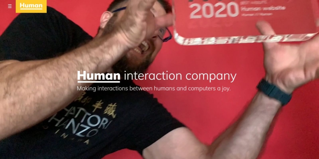
Straight away, they have your full attention. This is a great example of how video can be used to make your homepage far more engaging than just static text, while also giving visitors a sense of your company culture and unique brand story.
Another interesting thing about the Human website is its placement of a hamburger menu on the left rather than on the right side of the page. Yet another little hint that this company isn’t afraid to be different or stand out.
In addition, they use bright, bold colors, while managing to keep the overall feel simplistic – reflecting how they want to engage with their audience. And rather than a single call to action, they let their past work and accomplishments drive engagement. Below the fold, visitors can scroll down through a long gallery of case studies and success stories which easily showcase the scope of the work they do, and how well they do it.
For small businesses wanting to convey a "big brand" message, a story-centered home page conveys personality and engenders trust.
Need a little more inspiration? Here are some of the best home page design ideas and practices you could incorporate for your website:
Remember that winning awards for your home page doesn’t necessarily mean it will convert traffic into customers. Every audience is different, and what works for one brand’s prospects might not resonate with yours.
To really optimize your homepage and get it performing at the highest possible level, you need to test, tweak, and test again. Tools like heat maps (which show which page content gets the most attention and clicks) and Google Tag Manager are a great way to find out which sections of your homepage are the most engaging, and which get ignored – and why.
With this information at your fingertips, it becomes relatively simple to know what changes to make so you can work towards better and better conversion rates. Don’t be afraid to shake things up.
Feeling a little lost? MOJO can help! Our website design and development team specializes in unique, custom-made websites that humans and search engines love.